The Problem With Prescription Bottle Labels
Poor graphic design can lead to severe consequences.

After returning from an excruciatingly painful wisdom tooth surgery, the surgeon prescribed two medications to help fight off infections and reduce the pain, respectively. Then, I placed the bottles amongst a growing sea of uniform prescription cylinders.
You probably know which ones I am talking about.
They each follow the same format:

- Name is in large, bolded letters
- Address is in tiny letters
- Colored box that tightly surrounds the medication name and instructions
- Medication name is in large, bolded letters
- Strength of the medication
- Instructions are in slightly smaller, bolded letters
- Serial code is in a large, highlighted, bolded font
- The quantity in a small font (Not pictured above)
- Refillibility (Not pictured above)
- Company logo that takes up 1/8 of the space (Not pictured above)
- Company address in a small font
- Company phone number in slightly larger font.
Was that a lot to take in? Same here.
This is an excellent example of what makes graphic design so critical to the workings of our modern world. The graphic designer has the ability to emphasize words and phrases that are meaningful to the reader, while still maintaining the availability of relevant information.

To enhance the effectiveness of prescription bottle labels, we need to identify its frequent users. According to the CDC, approximately 85% of American adults who are over the age of 60 are reliant on medications. Yet, according to the American Family Physician journal, 1 out of every 3 Americans that are over the age of 65 have some form of vision problems.
On standard prescription labels, the medication name and the instructions are so scrunched together that it can be difficult for the reader to properly understand. In fact, the highlighted, bolded, and enlarged serial code is given more importance than the medication name itself. This is only exacerbated by the fact that the main demographic of drug users are visually-impaired.
Perhaps the constraints of the pharmaceutical bottle’s compact size precipitates its ugly label design. However, the trademark pocketable size does not affect its ergonomic qualities. Usually, daily medications are taken in the private comfort of home, right before (or after!) a bustling work day. It is rare that people need to stick a vial of life-saving medication in their back pockets, so they do not miss their Aunt Jenny’s wedding. Sure, the compressed size is useful, but it is not needed.
The status quo of standardized prescription bottles are not meeting the needs of its users. This calls for a total prescription bottle makeover. Maybe something like this:
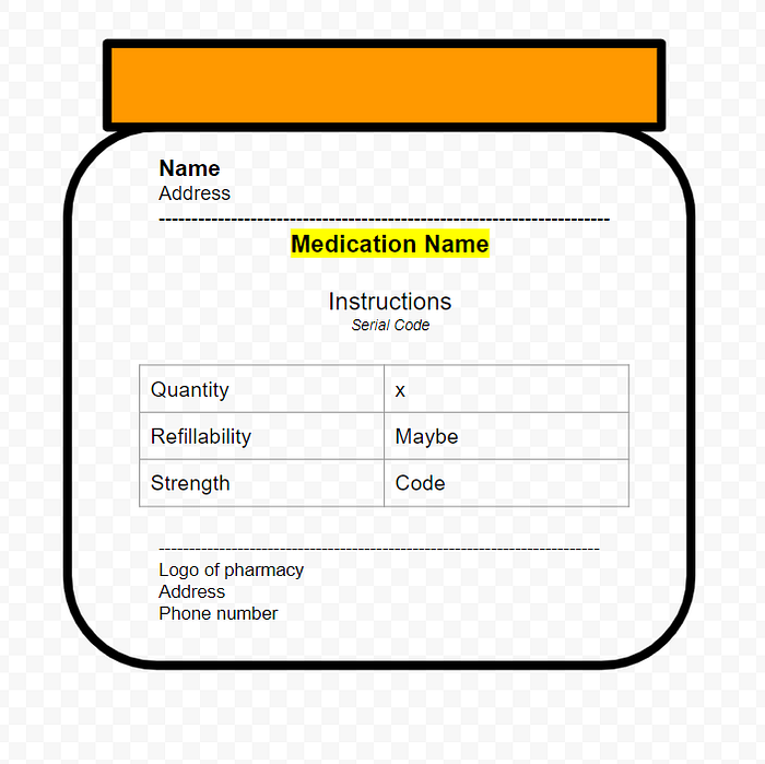
The bottle should be wider to increase clarity. The medication name should be clearly written. The logo, address, and phone number should be diminished.
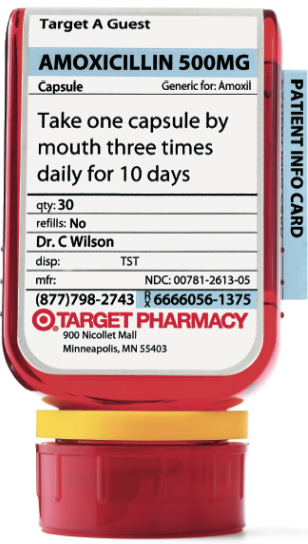
It isn’t fair to completely generalize the ailments of the pharmaceutical industry, however. (Pun intended!) Target introduced ClearRx capsule bottle design in 2005 to better serve its customers.
But until the day that ClearRx and other similar designs become the forefront of a Google search for “prescription bottles,” there is still work to be done.